4 signs you need for your farmers’ market stand
A good sign is the very first part of your sales strategy. An effective one will catch people’s eye when they get within 10m or so of your stand.
Words: Nadene Hall
1. The banner
The most prominent sign is the main banner. Ideally, it’s positioned along the front of your stand, above head height so people can see it from a distance. Research into outdoor advertising signage has found certain colour combinations work better than others.
The top three are:
1. Black on yellow
2. Black on white
3. Yellow on black
However, the same study found you need to keep in mind who you are targeting. Older people like blue because it’s easier for them to see. Men prefer deep shades of a colour, while women prefer more delicate tints.
The font you use is also important. ‘Serif’ fonts, which have little lines or flicks on the end of letter strokes, are generally harder to read than sans-serif fonts which have cleaner lines.
View this post on Instagram
Less is more when it comes to the wording. People take just a few seconds to glance at a banner, so you want to make it as easy to read as possible. It should identify the name of your business, including the logo, and perhaps your speciality, eg organic, heritage tomatoes.
Bonus tip: use the same font and colours on other signs and packaging to give a professional, cohesive look.
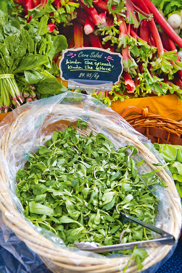
2. The product sign
A good sign will include (where appropriate):
• the variety;
• a valuable attribute, eg heritage, picked today, unsprayed, organic;
• a way to use it, especially if it’s something people are unfamiliar with;
• the price.
Don’t overdo the wording, eg don’t add in other words such as ‘delicious’ if they’re not adding valuable information.
Bonus tips:
• if possible, choose price signs that are easy to edit, eg chalk board, plastic.
• when a sign starts to look worn, replace it.
• a sign should never block your produce or your interaction with customers.
3. The photo sign
Worldwide, one of the big reasons people say they go to farmers’ markets is because they want more of a connection with their food and a personal relationship with the growers. They want to see how and where their food grew. Photos of your land and production process are an effective way to bring it to life. It helps if you can include a cute factor, such as children and animals.
Bonus tip: do things to encourage people to slow down at your stall as there’s a chance they’ll buy something. One way is to stand out and draw people’s eye and attention. For example, you could wear a funny hat or have a funny sign.
4. The ‘coming up’ sign
To make a profit, you want repeat customers. A great way to encourage them to return is to let them know about new products or specials you’ll have in the coming weeks. If you’ve got no room, make sure to tell people as they buy, as an invitation for them to return.
Bonus tip: Negative signs are a big turn-off. Try to avoid signs saying things like ‘don’t touch’.
MORE HERE