Eating with the eyes: How Resene colour influences NZ Life & Leisure’s food editor Emma Boyd SPONSORED
As the adage goes, “The eyes eat first.”
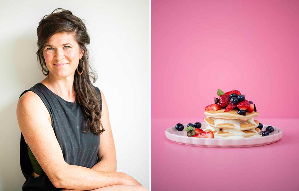
NZ Life & Leisure food editor Emma Boyd knows first-hand the benefits of colour. She reveals how Resene paints help elevate her food photography.
Created for Resene
When did your interest in composition and colour first begin?
I have fond memories of being eight or nine years old, carefully arranging the treasures I collected on the set of drawers in my room. I would place that there or this here, then take a few steps back to survey the scene. Pinned to the wall above was a collection of fans from my grandmother’s travels through Malaysia and Japan. These, too, were arranged to make sure they worked with all my trinkets below. My awareness and appreciation of colour began when I studied industrial design in Wellington and was honed when I first started working with food as a recipe writer and photographer.
How does colour theory come into play when food styling?
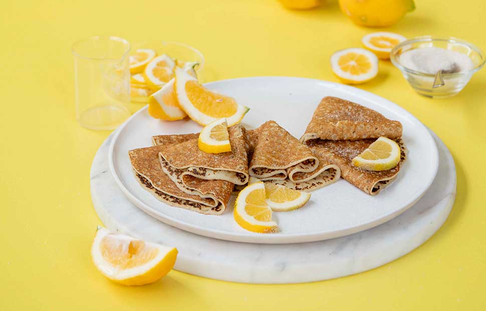
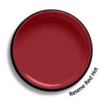
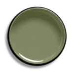
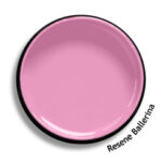
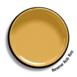
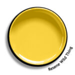
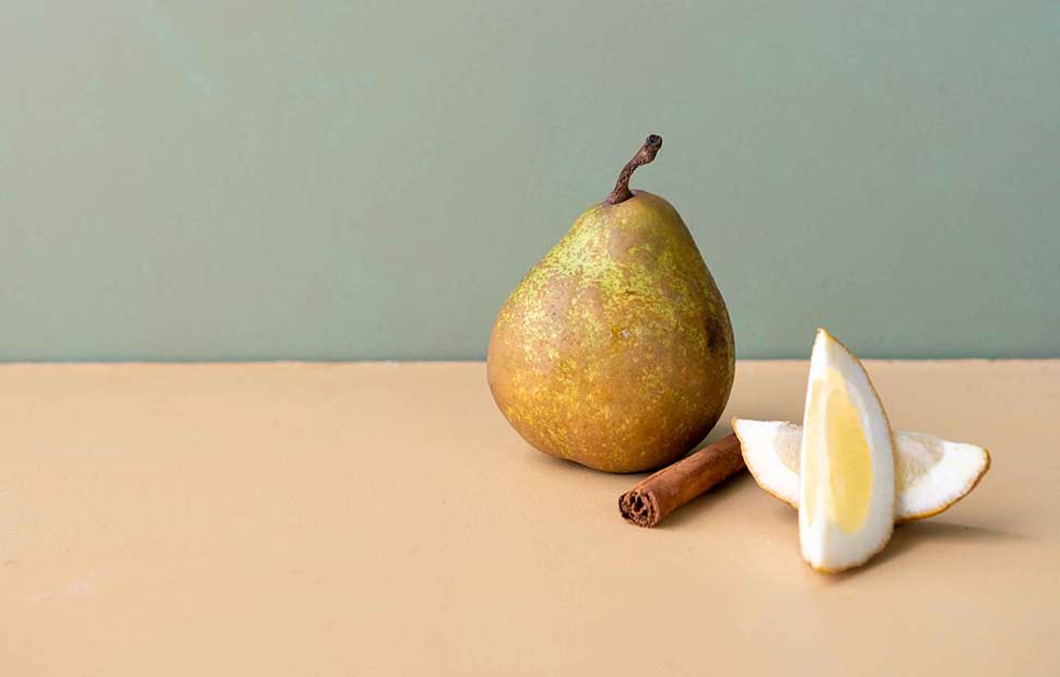
Colour can complement the food — be it in the backgrounds selected, the plates, silverware and glasses. So, its use requires careful consideration. Depending on the client, I will sometimes use muted colours, say Resene Sage (a lovely herby green) and cream (Resene Thorndon Cream is a favourite), to tie in with the food, for example, a bowl of wintergreen risotto. This results in a shot that is harmonious, restful and calming. I love tonal pairings like placing lemons in front of bright yellows like Resene Wild Thing and more muted hues like Resene Rob Roy (a gold ochre). Colourful contrast can also inject energy, playfulness and fun into a shot. I’ve used Resene Ballerina and Resene Red Hot together as the highlight colours for a strawberry milkshake, placing pops of colour in the form of ripe red strawberries.
Where do you find inspiration?
As with any other creative endeavour, inspiration comes in many guises. Design is hugely inspiring: the use of white space and the way colours are paired. I have a serious appreciation for well-dressed people (as a solo mother of three young kids, this is something I aspire to) and how they are, in a sense, a canvas for colour and texture. If you don’t follow the Resene Instagram account, then you should. It is a riot of colour and does a fantastic job of inspiring followers through various colour combinations, from classic to fun and totally unexpected. I doubt one could leave without having been inspired. Resene has encouraged me to make those colour choices that I might have shied away from and have fun.
Do you have any favourite colour pairings you keep coming back to?
Pink and orange are a fantastic combo and grab attention when paired. I am also really drawn to muted hues such as lavender (Resene Chalk Lavender) or dusky pink (Resene Pot Pourri) with muted green like Resene Flax and creams like Resene Thorndon Cream. I also love working with dark tones, as they bring a real sense of moodiness to a shot. Light becomes a key player, drawing attention to the subject or partially obscuring it for a dramatic effect. I am fortunate that my work is so varied that I play with all of the above all the time, filling up my creative tank.